20 years ago, when I started working with my clients, many people saw a business website just like a useless expense.
Times have changed and now everyone knows that, if you have a business, a website will be your main marketing foundation and the most effective lead generation source.
After launching hundreds of websites, I was able to come up with the biggest website development mistakes to share with you today.
5 Crucial Website Development Mistakes
#1 You Start Your Website without a Plan
Hey, no fingerpointing here, just stating the obvious: I started my own share of personal projects and see this in some of my clients: we have a great idea of a website and just go for it.
Imagine that, as I do all the work (and do it fast after 2 decades of experience), I’ve started many pet projects that allowed me to test new strategies or just have some geeky fun.
But, if you fail to plan you … yes, you know it well … plan to fail.
Here are the 2 main planning issues I’ve noticed in my career:
- no monetization plans – hobby websites will fail, if you can no longer sustain them on the long run. No matter how excited you are about a niche, no matter how much time you have now to invest and money, if you cannot monetize, you will close down / sell in the future. As soon as I became a mother, I had to ditch about 5 niche forums I used to run. Why? Because I needed to care for my newborn and a project that earns no money was a waste of time.
- no SEO planning – I know my web development services are a tad different than others. I don’t just blindly build client websites, because I know they will fail. A lot of work goes into planning, SEO research and competition analysis. Only then we know what angle to approach and how we can actually outrank them.
#2 Wrong Platforms or Designs
When it comes to ranking a website on page 1 in the search engines, there are 3 main ranking signals you need to have in mind:
- mobile-friendliness – if your website is not mobile-friendly, you will not rank well or, will be de-ranked at the next algorithm updates
- code cleanness – search engines don’t read your nice designs, they read the code. Right-click on your mouse and choose “view source”, when visiting your website. If there’s only gibberish and you cannot see your main content easily, that’s exactly what the search engines see as well: a lot of clutter and little actual content.
- fast loading speeds – fast websites rank better. Even if the trend is to have faster internet speeds, the main search engines still care about visitors experience and rank better the websites that don’t take an eternity to load.
The main mistake here is that many clients choose the wrong platforms (Wix, Squarespace or similar “free” website builders) or, if they do go with a decent one, they choose “premium” themes that just look cute, but are horrible when it comes to code and loading speed.
A great way to find out if you have reached a decent web design company is to ask them how they’re planning on building your website. If they mention anything like using a “premium” theme (Avada, Porto, Divi, Thesis) or using a visual builder, run for the woods.
Why?
Because your website will not do well in the search engines and then you’ll come to me to redesign it completely and pay for web design services again.
How do I build websites that RANK?
- I use WordPress – it’s super fast, SEO friendly and exceptionally easy for you to manage on the long run. While we do provide website maintenance services, if you want to manage it yourself, you can.
- I optimize for speed and code cleanness – As soon as the main design is up and running, I spend time making the website load as fast as we can, with a code that’s clean and easy to read. So that the search engines have no issues reading your content and ranking you accordingly.
- Write content that will outrank competitors – a lot of work goes into competitor analysis, keyword mapping and finding ways to outperform the competition.
#3 Wrong Keywords or no Keywords at All
We’re getting deep into SEO now and look into one of the biggest issues I have noticed all these years, especially when doing SEO audits:
Many of the audited websites have absolutely no keyword strategy and planning. Nada! Zilch!
Do they rank?
Well, they rank for something, as, if the website is not penalized, Google will try to find something in the hectic content and place them somehow in the SERPs.
Of course, most of these keywords are worthless: nu buyer intent, low search volumes, irrelevant for the business itself.
If you want to rank for a service you provide, then you need to have the proper page set up, the best and most relevant keyword planned for that page and then optimize that content for the exact keyword.
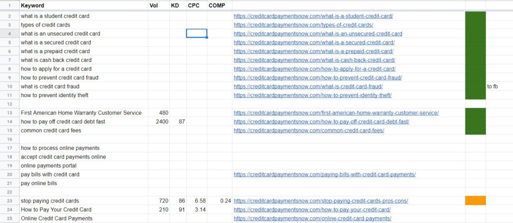
If I want to rank for “SEO Audit agency” for instance, then I need a special page for this main keyword, proper content, images and links back to it. And you do the same with each and every page that you write, whether it’s a presentation page or a blog article.

Take the above image for an example: each page has a keyword and I optimize carefully for that. If you do this with ALL your website pages, you’ll be amazed at the results.
#4 Poor User Experience
For most businessmen UX, UI and all these acronyms make no sense. They seem just like yet another fancy word web designers use to charge more money.
Yet, poor user experience will hurt your website and business on the long run. If your website visitors cannot navigate easily, cannot find your contact information in a snap, have to wait for minutes for a page to load or just cannot view your website in a smartphone, you will lose business.
- slow loading, not mobile friendly – we already know these are 2 huge ranking signals, so, by having a website that’s visible from the phone and loads fast not only makes lead generation easier (as customers can use the website on all devices and contact you), but it pleases the search engines, which translates into better rankings and, consequently, more leads.
- huge navigation – unless you are Ebay or Amazon, there is absolutely no reason to cram your navigation menu with tens of links. Have 5-6 main links (about us, services, testimonials, contact us) and then move all the clutter down in the footer.
- little to no content – back in the day, you could just whip out a simple website and call it a day. Now, you need to write content, not only to convince your potential clients you are the real deal, but to avoid a “thin content” penalty as well. In the past 2-3 years the search engines started ranking higher websites with more content. Aim for at least 800-1,000 words on all important pages and see your rankings soar.
Visit your website every once in a while, from a smartphone and from the computer as well.
Ask your family and friends to visit and write down what issues they come across: it’s difficult to find your contact information, they cannot understand clearly what you provide, your USP (Unique Selling Proposition) is not clear etc.
Then, based on your own experience and what they complain about, make changes and improve.
#5 Not Maintaining the Website Properly
A lot of business people think a website is just like some business cards: you order once, get them in your office and that’s it, maybe re-order a new batch in 2-3 years, when you gave out all existing ones.
A website is a different ball game: you need to constantly upgrade the platform (not a huge deal, it takes few minutes every once in a while, but it has to be done).
Make sure your copyright statement is appropriate for the year to date (nothing funnier than to read 2018 in the copyright notice, when you’re already in 2020.
Update the content: write in your business blog section at least every 1-2 months, update your portfolio, if applicable, write new details about a recent event or certification.
When a potential buyer looks for your products / services, an outdated website can show them you’re no longer in the business, so they’ll look for a competitor whose website is fresh and active.
These are the most common website development mistakes I found since running my web design business here in New Jersey. If you’d like your website to thrive online, let’s see how we can make it “pop” 😉


